Startling Graph about the Debt Ceiling and the National Debt
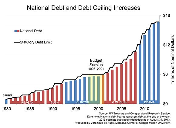
In anticipation of the debt ceiling debate/crisis/hysteria, Veronique de Rugy, a senior research fellow at the Mercatus Center at George Mason University tweeted a graph of all the times the debt ceiling has been raised since 1980.
It’s a simple but shocking illustration that tells the story of how America went from a national debt of $930 million to a national debt of $16.7 trillion in just over three decades.
The graph indicates that we clearly have two big government presidents to thank for putting Americans and the American economy in such a dire predicament: George W. Bush and Barack Obama.


 CFIF Freedom Line Blog RSS Feed
 CFIF on Twitter
 CFIF on YouTube